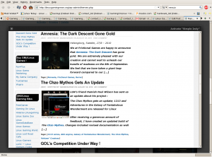
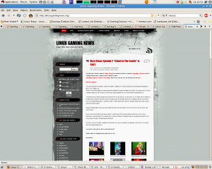
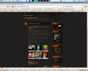
As you see now (01/09/2010), LGN’s theme has been changed to the temporary http://LinuxGamingNews.wordpress.com theme, I want to give it another shoot and see if you like it.
The few things I didn’t like about the old “dark” theme is that when I highlight things in bold, the changes barley seen, the text isn’t clear and the page width is lower (although the latter I can change).
Also both themes “suffer” from “long posts” unlike the original old lgn.linux-hardcore.com theme, the whole post is shown and not only the summery.
So I’ve made a new poll in which you can decide again, what theme would you prefer for LGN :
lgn.linux-hardcore.com theme :

If you have an idea about a whole different theme, please reply below.


I like a theme with a light colored background the most (this one is ok) . Personally, i find it a lot easier to read black on white. But what really matters is the content, that’s why i read your blog!
I’ve seen this theme on several other websites. You need a unique look to stand out.
I too, as many others with aging and challenged eyes, prefer a light background with dark font. Dark backgrounds with light fonts are extremely difficult to read, often quite painful, and leave residual retinal imprinting for up to times of 10 minutes.
Thanks.
I have young eyes but still agree with Susan on this one.
I HATE dark websites with light text, it really does mess with your eyes, keep it light and simple.
this light background is better then the dark one, agree though you will need to end up with something unique, what I do prefer about this site to the previous one is that the articles are fully here and not click here to read more.